SoZen Branding Suite
Brand DesignSoZen came to H&G in search of a new visual identity. Through a 1:1 consultation, we were able to dig a little deeper into the brand and how the branding suite should translate in an online capacity.
Background of Brand
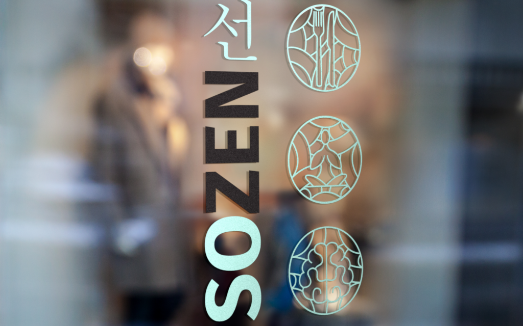
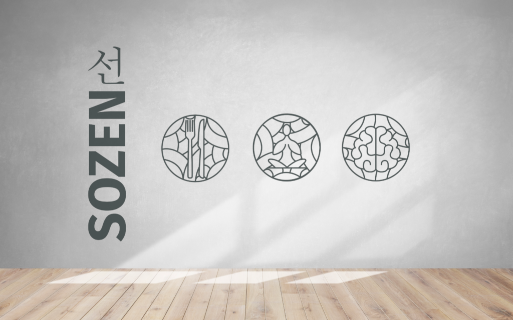
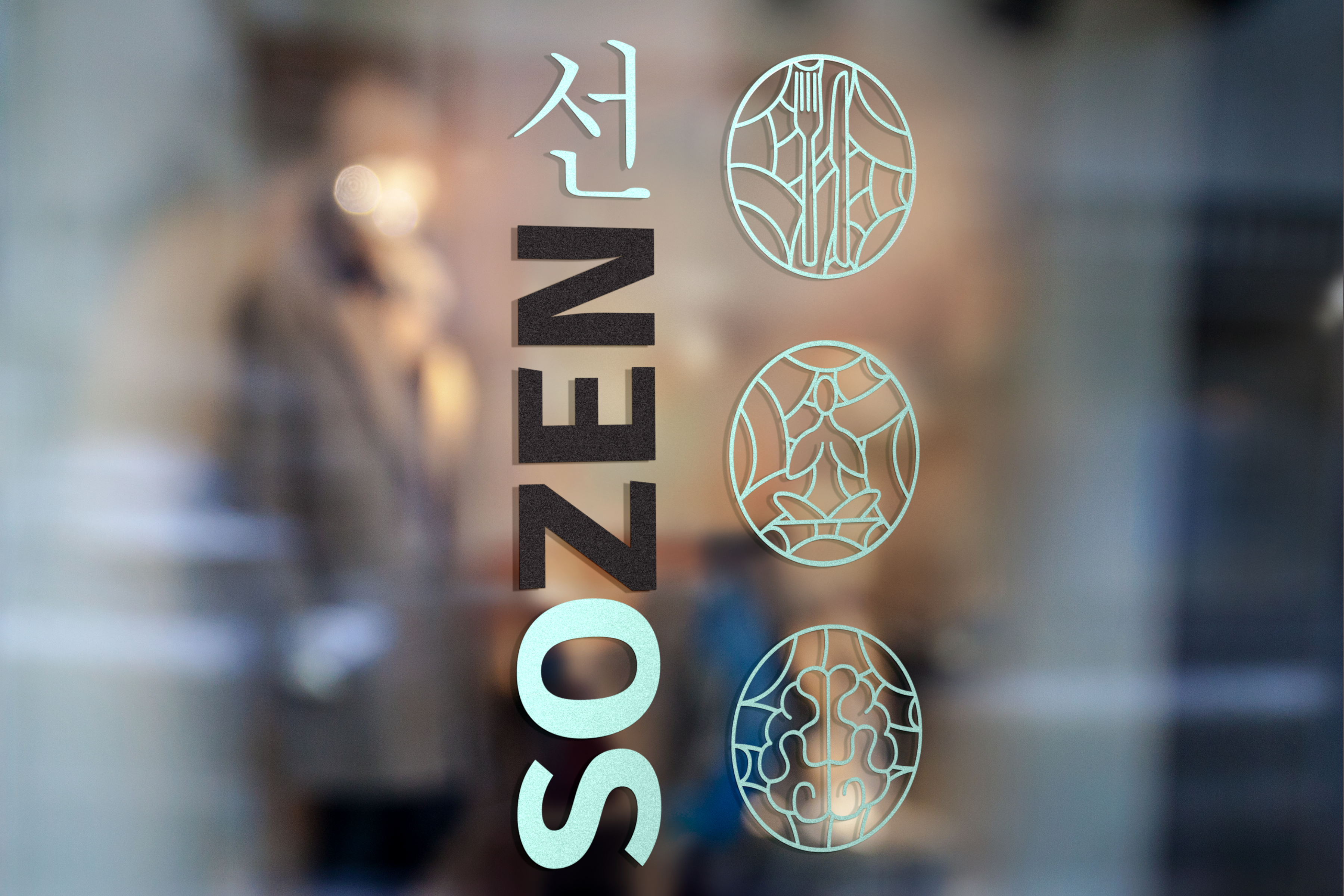
The SoZen business is a hybrid brand involving yoga, personal training and nutrition.
The client wanted the aesthetic to have a similar feel to other personal trainer brands but with a delicate feminine touch similar to yoga/holistic branding suites.
With Korean ancestry, it was important to the client that H&G involve this heritage in the branding to make the design authentic and unique to them.
Creation of Branding Suite
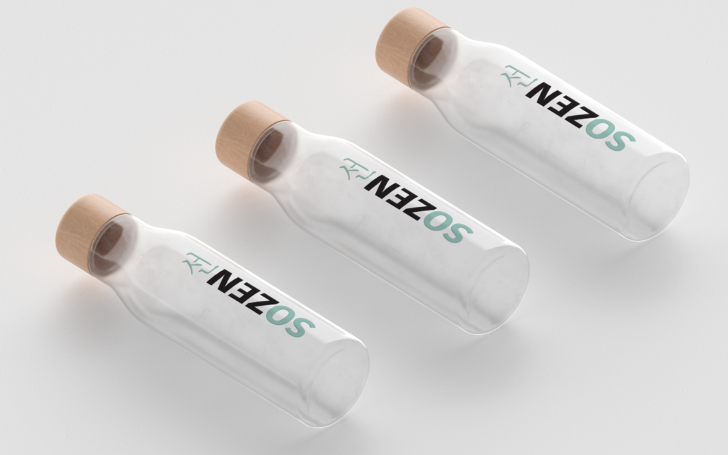
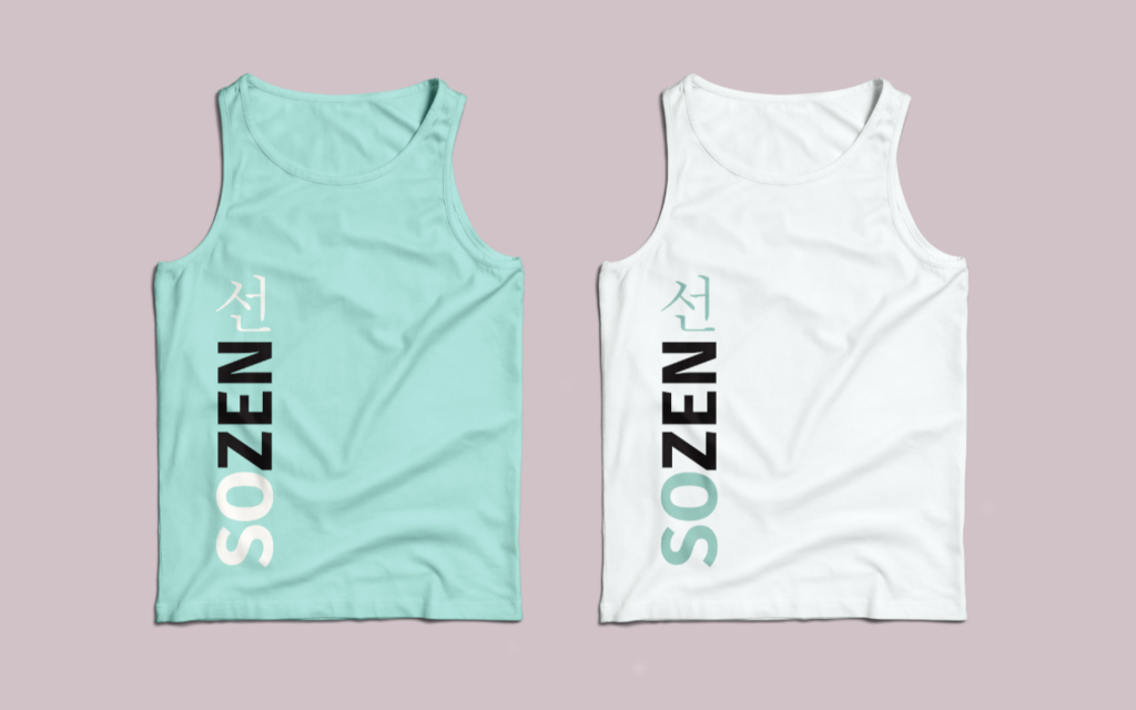
Reflective of other PT influencers and their branding, we used a typeface that is strong and assertive. To add that feminine touch we added thin lines of the Korean calligraphy and designed it written downwards instead of across in reference to Korean copy.
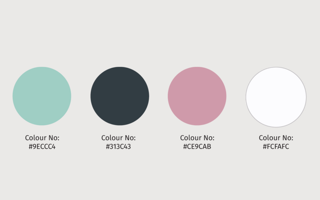
In terms of a palette, we wanted to use a calm and soothing colour scheme to reflect the positive mind, body and soul elements of the company, whilst also balancing out the strong, bold typography. With this softer colour tone, we found the perfect balance between the worlds of PT and holistic branding.
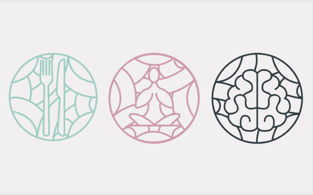
Lastly, a series of icons were created to reflect the core teaching principles of SoZen; Nutrition, Body and Mind. The icons design were inspired by Korean patterns that have curved, flowing, delicate lines tieing in seamlessly with the logo. These icons can be used across the branding in various ways, for example, in online videos and promotion for the brand. The icons can also be used alongside the logo when printed and can be used to decorate the space used for yoga.